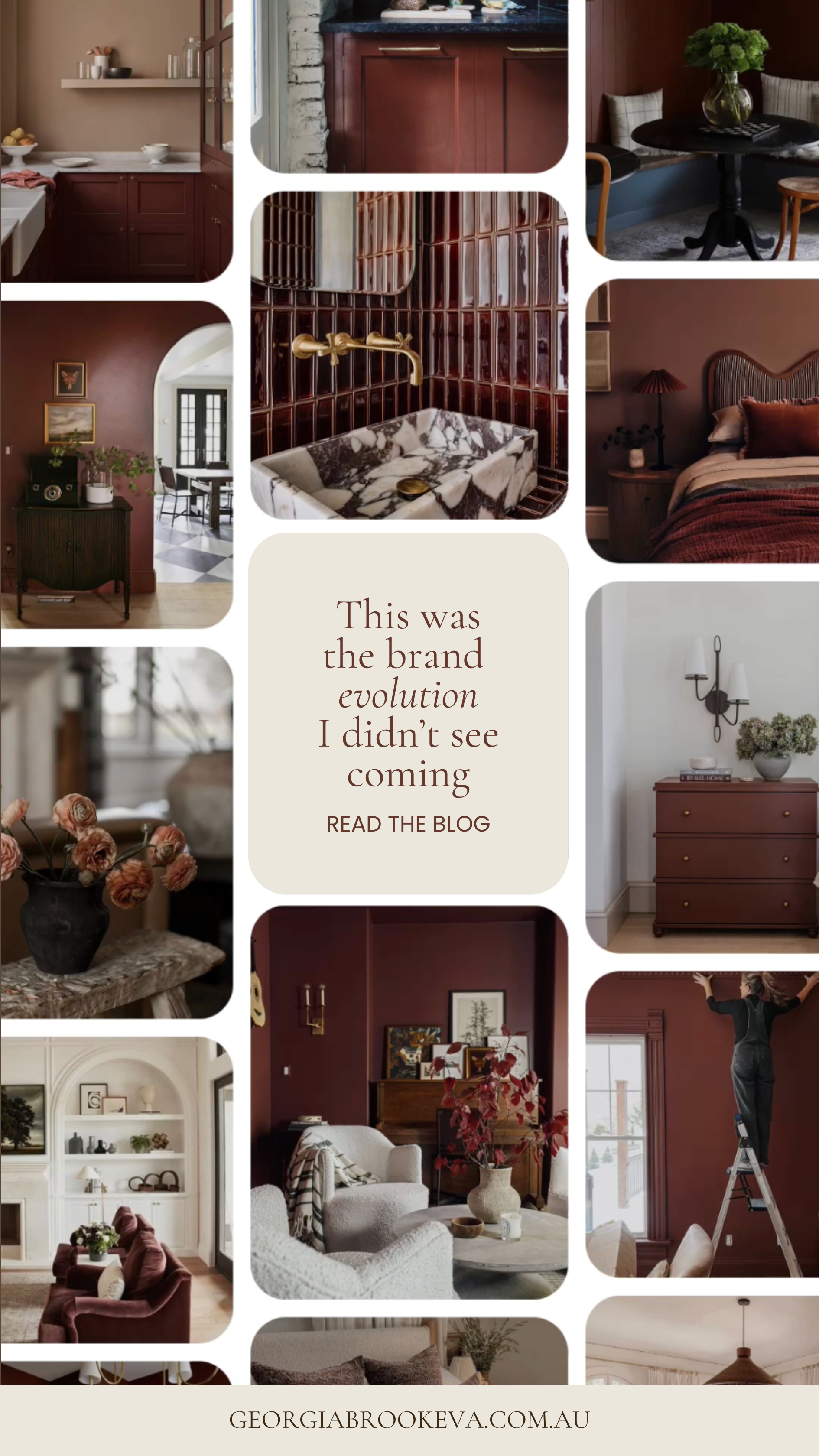
This was the brand evolution I didn’t see coming.
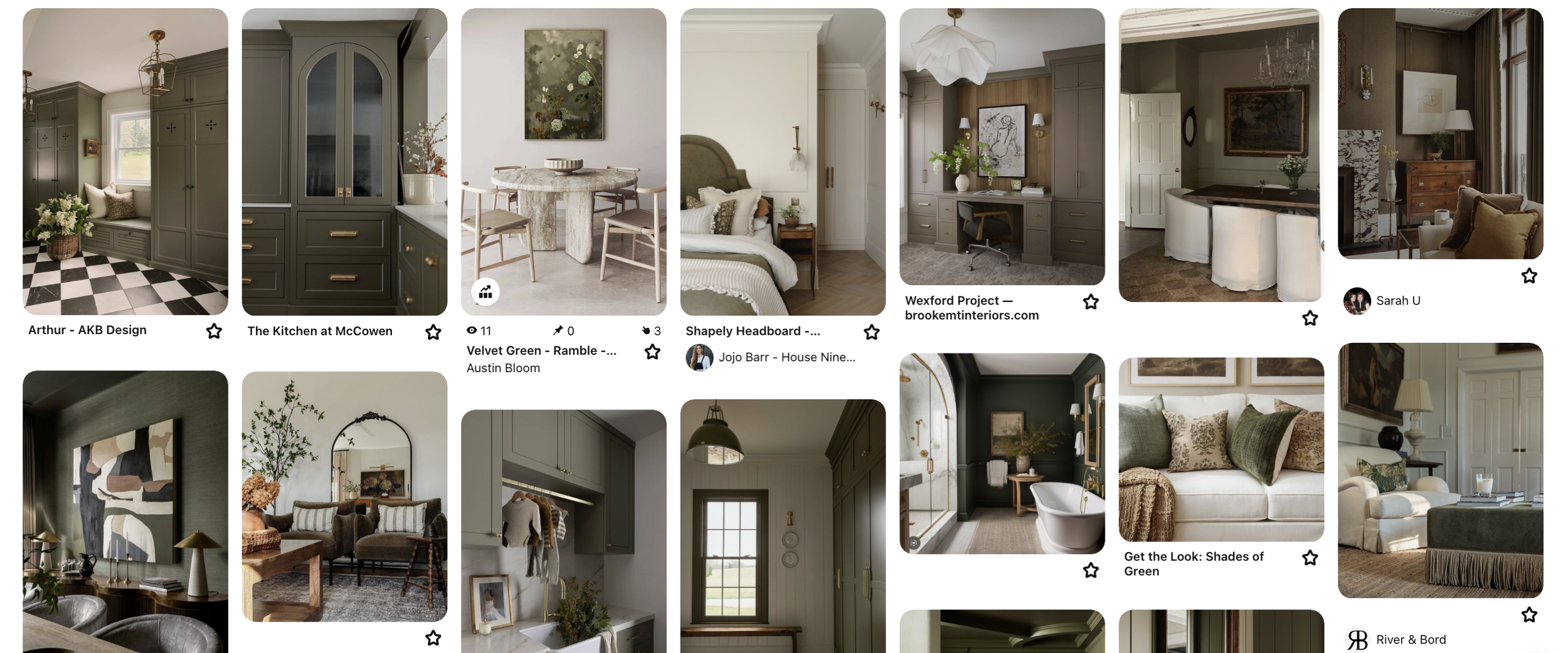
You have to understand; I’ve been firmly in Team all-shades-of-Olive since 2017.
My previous business was called Olive & Ivy, just to prove the point. I genuinely thought I would never find a more-me colour palette than olives and neutrals.
My “dream house” Pinterest board since forever has been full of organic linens, farmhouse antiques and an obnoxious amount of g r e e n.
Enter the totally unexpected, sexy AF, can’t-stop-thinking-about-you aesthetic I’m calling Claret Luxe.
It’s like a rich shade of lipstick that can only be pulled off in autumn months.
Earthy.
Hints of brown.
Pairs lovely with clay and brass.
That kind of red.
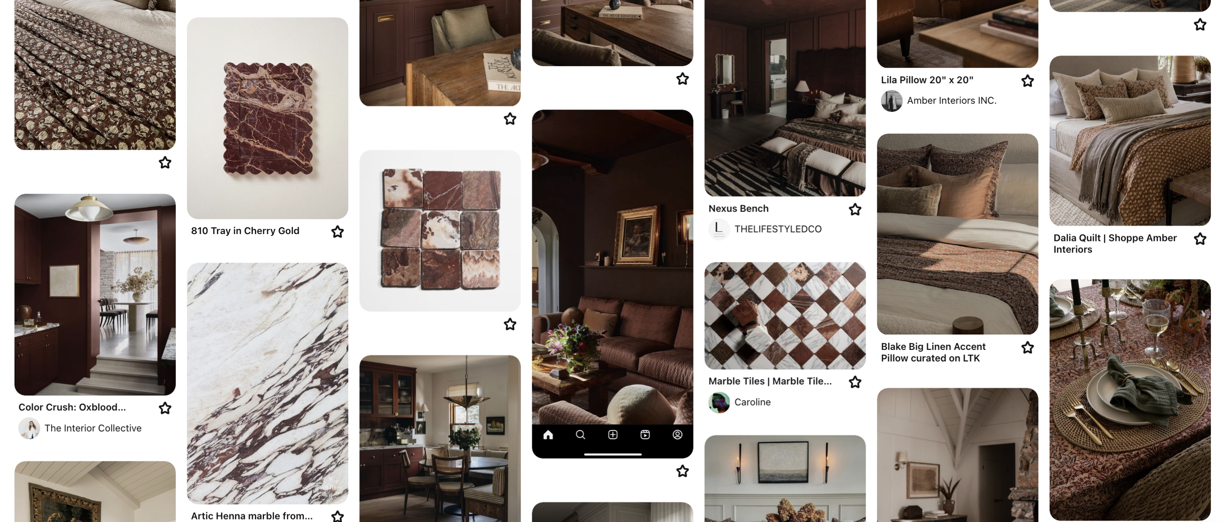
It’s an utter shock to everyone - myself most of all - that I’m suddenly and completely obsessed with this colour (insert mind-blown emoji).
Maybe you can relate to this, but I get intense colour moods. Like I need everything from my wardrobe, to my brand colours to my imaginary dream home to coordinate.
Is this a sign of ADHD? Or just OCD? Please tell me I’m not alone in this.
All that to say, you might have noticed the new accent colour I’ve recently incorporated into my brand. By staying committed to my typography, logos and lovely neutral chocolate/vanilla tones, I can easily slip in this claret colour for a seasonal refreshing.
Maybe it will last, maybe it won’t. Us multi-passionate creative types have a hard time sticking to just one beautiful aesthetic!
But for now, I’m in love in my little red bubble.
Join me in my red (or olive) obsession on Pinterest